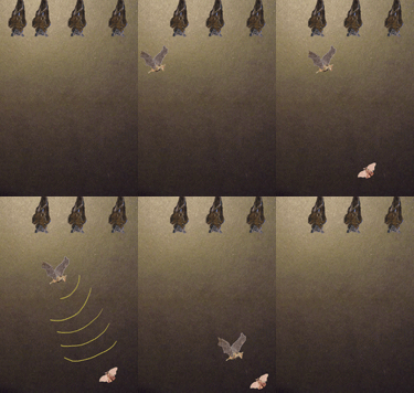
This is my last test to see if my other GIF is working ...
analysis
Tuesday, 28 January 2014
Monday, 27 January 2014
Sunday, 26 January 2014
Thursday, 23 January 2014
Photograph project
Here is a sneak preview of my one of my latest projects. Which is a photography brief we have to take pictures and arrange them into a photography book. At the moment I'm still working out what my theme should be. I quite like two at the minute, one is doors and the other is unusual perspectives such as forest floors and unusual angles and such. The photographs below are two from this collection.
Saturday, 18 January 2014
Book Covers
So this week I've been busy working on my two book covers for one of my University projects. The two I choose where "The Snow Child" and "The English: a field guide" one is really funny and humorous and the other a fairytale-esq novel. I wanted to represent the tones the books portray without giving any of the plot away.
"The Snow Child" by Eowyn Ivey was such a beautiful tale I wanted to try and do it justice. The book is set in Alaska, so I wanted to show the environment and the harshness of the weather. Also how the two main characters are set out in the wilderness. This is why I separated the cabin from the main front page to create the distance in both a literal and metaphorical sense. I didn't want the front page to be too cluttered to show the starkness of the landscape and how they where just surrounded by forests and trees.
The second book I choose The English: A field Guide by Matt Rudd, is a funny humorous book poking fun at the English. I like how we are written about like odd little creatures with funny habits. I wanted to show this fun element on the front cover. I choose to use bright images and repeat them to give them a more graphic feel.
Monday, 13 January 2014
What inspires me
Its quite a good question what inspires you and something which can be quite hard to answer. For a little end of semester task we had to put together ten artists work who inspires us. I really enjoyed doing this as it made me focus on what makes me tick as an artist. These are the following ten which I came up with after much time spent thinking and looking around.
Chrisitian Lacroix sleeping beauty. I just find this piece so enchanting and beautiful. I like the combination of the black and white castle suggesting to me the traditional nature of the story and then the brightness of the other elements. I also like that it is a collage as this is a medium I am interested in.
Cristiana Couceiro Bentley-cover. I again like how this piece uses colour combined with black and white imagery. I think the different elements help to lead your eye around the piece. I also think the negative space is used beautifully so the piece seems so balanced. I think the overall effect it has is really pleasing to the eye.
Katie Rodgers. The combination of photography and watercolour creates this beautiful other-worldy picture. Almost like it has stepped right out of a fairytale. I like how it creates a story which just makes you want to keep looking at it.
Angie Lewin. I love the colour scheme, how the background colour ties into the brighter pops of red and yellow and the overall feel it gives. It is interesting and makes me want to buy this book. It also make me want to draw nature and find inspiration from the world around me.
Chrisitian Lacroix sleeping beauty. I just find this piece so enchanting and beautiful. I like the combination of the black and white castle suggesting to me the traditional nature of the story and then the brightness of the other elements. I also like that it is a collage as this is a medium I am interested in.
Cristiana Couceiro Bentley-cover. I again like how this piece uses colour combined with black and white imagery. I think the different elements help to lead your eye around the piece. I also think the negative space is used beautifully so the piece seems so balanced. I think the overall effect it has is really pleasing to the eye.
Katie Rodgers. The combination of photography and watercolour creates this beautiful other-worldy picture. Almost like it has stepped right out of a fairytale. I like how it creates a story which just makes you want to keep looking at it.
Mark Powell- I find this bird illustration interesting as it is precise and thoughtful and drawn so well. I think the combination of the map and the drawing is really pleasing.
Heather Landis. I like the composition of this piece and how it it quite whimsical. I like how the lines lead your eye towards the middle scene. I also like the texture of the background and how all the different collaged pieces work together to create the full effect.
Mercedes DeBellard. I think this image is really pretty and delicate. I like the combination of hand drawn and the digital colours. I think the light pink works well with the subject matter. I also like how the type is integrated into the composition.
Phillip Bannister. I love how this artist uses the medium of water colour as i think it looks picturesque and a place you just want to visit. I like how the pice doesn't have constraints and just seems to fade off at the edges.
Lauren Child. I enjoy looking at this piece and i think it is really fun. I think the medium is used so cleverly with the characters and looks different to a lot of other book illustrations i have seen.
Subscribe to:
Comments (Atom)


